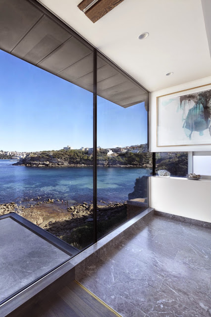
The spacious contemporary home was designed by Rolf Ockert Design.
Clovelly by Rolf Ockert Design:
“Having seen some of our earlier work the owners of this extraordinary oceanfront site invited us to submit ideas about what a new house could look like. They had lived in a ramshackle cottage on the site for several years before and therefore had an intimate familiarity with the advantages and disadvantages of living in this exposed spot.
Due to several key issues inherent to the site the design process took us through some radically different sketch designs before settling on the one that was finally realised.
The most magnificent quality of the site, the amazing ocean view, lies to the South while the sun still of course circles around the North. To focus on its unique location while getting natural light inside the house was designed around a central void with a row of large operable skylights above it, angled to the North.
The site is surrounded by two out-of-scale apartment blocks to the North and to the West, posing privacy as well as aesthetic issues.
Being on the ocean front also meant that the roof height, particularly to the Southern, ocean, side, had to be minimised to minimise the impact on neighbouring residents.
While the original cottage already had wonderful views onto the rock cliffs across the bay a slight swing of the external wall suddenly opened up expansive open water views in addition to the more intimate bay views.
The Southerly wind on this site is a dominant force, as the clients had experienced over the years. Even on clear days it is strong, quite possibly also cold enough to prevent any outdoor activity or even the opening of any windows.
These key factors together with of course countless smaller factors and decisions along the way shaped the house to what it is. The unusual but elegant roof shape allows sunlight in while along neighbours to allow water views over the lower end. The expressive angled concrete wall mirrors the roof shape but in negative, resulting in a complex facade geometry along the main face, enhanced by the movement of ever changing shadows over the shapes.
The light void also contains the central circulation, the stairs. These are light and airy without feeling flimsy. To the North of that are two levels, to the South three, taking advantage of the natural slope of the site. The main living space is on the Entry level, connecting it with the Northern garden and Pool as a very generous central family area. Upstairs are the bedrooms, on the Southern lower level several areas for more individual activities, Study, Studios and Library.
As a consequence the house was designed, unusually and against our original instinct, without any opening windows or decks facing South. Instead large frameless floor-to-ceiling double glazed elements allow uninterrupted views over the Pacific and allow a more intimate connection than framed openable glazing elements would have afforded.
An outdoor deck is attached to the side of the Living area, allowing outdoor activity on suitable days without interrupting the front row feel the house enjoys.
The original Southern slope in front of the house was full of building rubble from some previous incarnation. Once that was all removed several large natural sandstone blocks that had fallen eons ago and stood upright, affording us an unexpected, giant japanese-style rock garden.
The materials for the house were chosen for a variety of reasons. First of all they had to be suitable for the harsh salt spray environment where everything gets a thick coating of corrosive salt within a few days. They were also desired to be suitable for the location, reminiscent of floatsam, rich but weathered. Finally the rich natural palette of coastal colours, gerys and red in the rocks, blues and greens in Ocean and sky, provided already a magnificient canvas of colour and texture dominating large parts of the house. The rich geometry in the house as well as the resulting ever changing play of light in the interior and exterior spaces also meant that we did not feel the need for strong colour or texture, elements we love to employ in other settings. The resulting material palette relies on very few elements, the strong raw concrete, along the outside wall as well as to the living room ceiling, dark timber in floors and joinery, both offset with white walls and joinery faces and of course the ubiquitous glass. Both, outside floors and walls as well as interior benches are finished in the same, earthy grey stone. Having these few elements used in a diverse range of applications throughout the house also tied the many different spaces of the house together to a coherent whole.”
Photos by: Sharrin Rees


No comments:
Post a Comment